Photography is such a wonderful hobby. Many women over 50 begin looking for sustainable hobbies to take them into an active and creative retirement, and photography is an obvious choice.
In this fabulously helpful guest post by Max Therry, we take a look at how we can make our photographs more appealing with some basic photo editing techniques.
Photo Editing for Beginners
Photo editing is an essential part of taking good images and making them great, but it can be confusing for beginners to get to grips with. If you open any modern image editing software, you’ll be overwhelmed with tools and almost too much choice! Which ones do you use, and when should you use them?
Simple Photo Editing Workflow
In this article, we’re going to look at a good, basic editing workflow, which will take your image from straight out of the camera to the final polished version. It’s important to have a workflow in place, so you get used to following a sequence of steps in the right order, instead of jumping in and randomly making edits.
You should be able to follow these steps in any image editor, as they all have these same basic tools. Let’s get started!
Monitor Calibration
First things first – if your computer monitor isn’t calibrated to show the true colors and brightness of your images, the work you do in editing them will be wasted.
Most computer monitors have basic calibration options on them, and if that’s all you have then try to adjust the settings so that colors look right, and it’s not too bright or too dark.
If you’re serious about photography, the best thing you can do is to invest in a proper monitor calibration device. These handy little tools are usually laid flat against your screen and the software runs through a series of tests to determine and change the colors and brightness of your screen. You will need to use them to recalibrate your screen around once a month, and you will be surprised at the before and after comparisons of your screen. They can be quite expensive, but you don’t need the professional versions – get one that’s easy for you to use.
Shoot in RAW format
You will get far better results in your finished images if you shoot RAW files in your camera. RAW files contain all the image information, which is why they are much larger than JPEG’s, which contain a compressed and cut-down version of the image data.
You can do far more things with RAW images, such as change the white balance, or adjust the shadows and highlights – things you can’t do on a JPEG – and your final image quality will be much higher when you go to output it as a JPEG or TIFF file.
White Balance
It’s far easier to set the correct white balance on your camera than it is to change it later in an image editor, but we’ve all had times where we’ve forgotten to change the white balance on camera and only noticed when it’s too late!
If you have shot in RAW, it’s easily changed. Put your image into your image editor (I’m going to use Luminar):
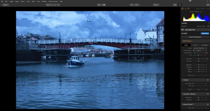
As you can see, this daylight image was mistakenly shot with Tungsten white balance, which has given it a very blue cast. Find your White Balance controls and change it to the correct white balance, in this case it’s “Daylight”:
You can also change the camera profile here, to the one that matches your camera to give a more faithful rendition of the image. Lightroom and some other image editors also give you this choice.
Here’s the image after the white balance has been changed, and as you can see, it’s as simple as one mouse click:
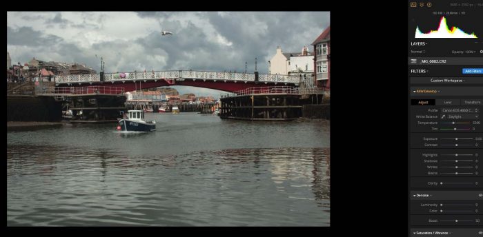
So, we’ve changed the white balance, but this RAW file still needs some adjusting to make it stand out.
Lens Corrections
The next step is also simple, and it involves using your image editor to correct well-known lens distortions and vignetting to improve your image. Lots of different lens brands have lenses that give certain optical characteristics, such as distortion or dark edges to your image.
Modern image editors have many lens profiles stored, and it’s a case of choosing your lens from the drop-down menu and applying that correction, using the sliders or auto corrections, depending on your image editor. Sometimes it won’t make a visible difference to your image, but sometimes it will make the image lighter or darker, so it’s wise to complete this step before moving on to cropping.
Chromatic aberration is the annoying purple or green edges you may see where you have shot areas of sharp contrast, such as tree branches against the sky. Click the checkbox to reduce that, and click Defringe too.
Framing: Crop and Rotate
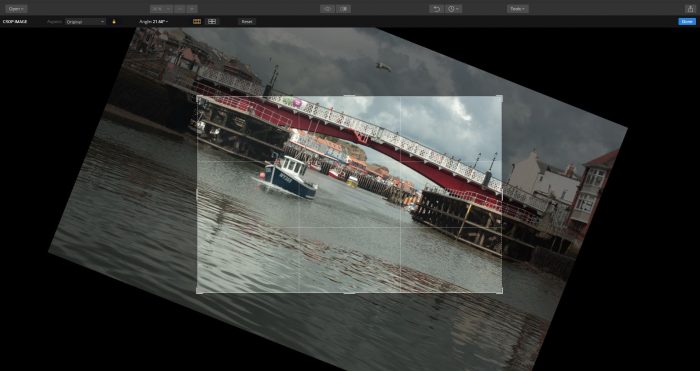
The crop tool on image editors is very useful for re-framing your image and getting rid of unwanted things at the edge of your image. It can also be used to zoom in closer to a subject. Most crop tools have a “rule of thirds” grid overlay, so you can line your image up with the gridlines when you crop. Crop tools also allow you to crop to many different ratios, such as Original, 1:1 (square) and unconstrained, which allows you to crop each side to unconventional ratios.
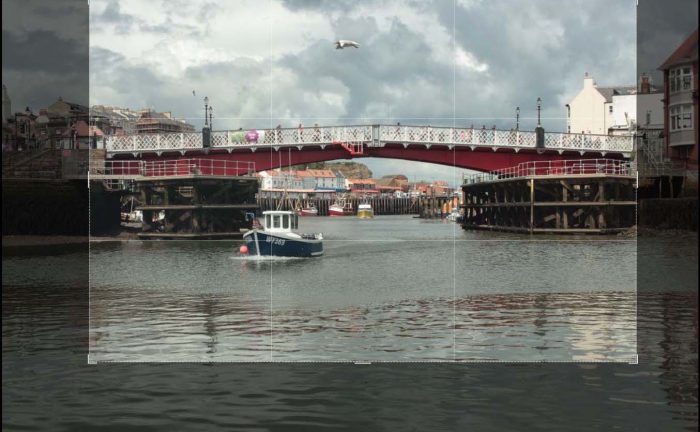
Rotate allows you to straighten wonky horizon lines or verticals, and you can add a little creative flair by tilting your image to one side or the other. Simply grab the rotate handles at the side of the crop overlay and move your image around. In Photoshop, it is more gandy to use Rotate View Tool (right click on the hand icon on your tools panel)
Exposure and Histogram
Let’s look at exposure next. One way of checking your exposure is by looking at the histogram, which all image editors have. It looks like this:

The left-hand side of the histogram contains the shadow data from your image, the middle contains the midtones, and the right-hand side has the highlight information. The higher the peaks on the histogram, the more of that type of information it contains. With this image, the midtones are brighter than both the shadows and highlights.
One way of telling if your shadows are too dark or highlights are too light is by looking at the histogram and turning on the clipping warnings. These are the little triangle icons at each side of the histogram, and if your image is seriously under or over exposed, it will show you where on the image the clipping has occurred.
For the sake of this tutorial, I’ve adjusted the exposure to show you what the clipping warnings look like:

This image is seriously underexposed, and if you look at the histogram you can see all the image information is to the left-hand side, which means it has no midtones or highlights. The blue areas indicate solid black, where there are no areas of light at all. You can save clipped shadows in a RAW file by adjusting the exposure and shadow sliders.
The image below has the highlight clipping warning on, and all the red areas are where the image is overexposed and has no detail at all. Blown highlights are harder to save than dark shadows, because there is no image data there to retrieve. You can usually dull the highlights a little, but if you go too far it will look strange and flat.
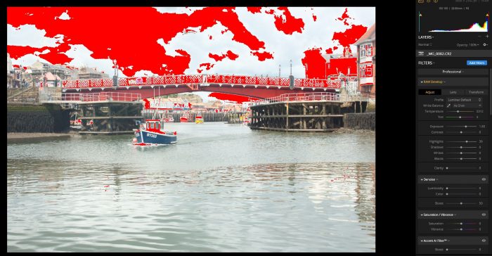
The sky and any white areas in the image is usually where highlight clipping occurs, so when you are shooting digital, try to err on the side of underexposure, as it’s easier to fix than overexposure.
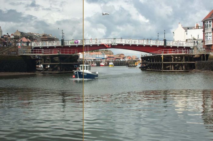
Use the exposure, shadow and highlight tools to get your image to what you think is the correct exposure. I’ve adjusted and brightened the exposure on the image below, as you can see in the before/after split:
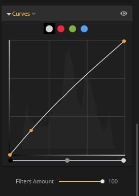
Another way of adjusting the exposure is with the Curves tool. This is a graph that has a diagonal line running across it. The left-hand side of this line is the shadows, and the right hand is the highlight. The middle is the midtones. If you want to raise the shadows, click and pull the bottom of the line upwards, if you want to add more shadows, pull it downwards.
Curves can give you a better result than just using exposure to brighten or darken your image, as it shifts only the area of the image you want to change, not the whole exposure, which means you can lighten shadows and midtones without touching the highlights. The image below shows exposure adjustment using curves:

It’s brightened the image without overexposing the highlights. I did this by adjusting the shadows just a little. The orange dot in the line is where I pulled the curve up slightly:
Contrast and Color
The white balance is adjusted, exposure has been tweaked, but the image still looks a little flat and dull. We’re going to apply contrast and color to make it stand out.
There are several types of contrast adjustment available in image editors now, such as color, shadow, midtone and highlight contrast, but I would advise not using these until you become more advanced – you don’t need them to do a good edit, and you really need to know what each one does before you use them.
For this image, I used the simple Contrast slider, and adjusted it upwards to add some richness and tone to the image:

As you can see, it’s really brought the colors out. Normally I wouldn’t add so much contrast to an image, but it’s a case of seeing how much adjusting suits each photo.
Saturation and Vibrance
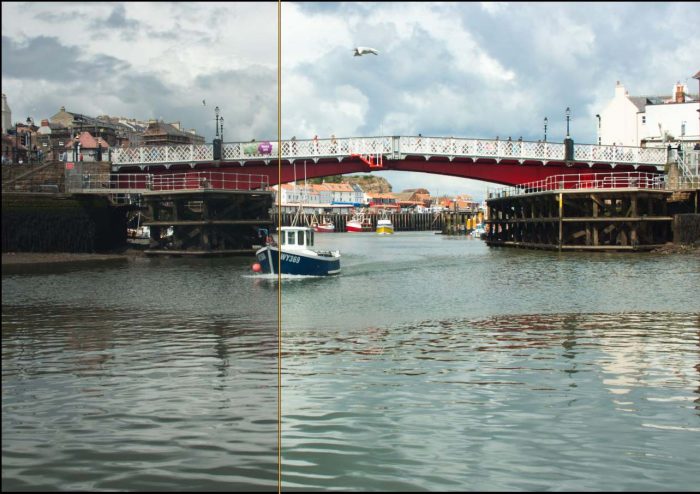
Your next adjustment should be to tweak the colors a little, to make your image pop. The simplest way is to add a bit of saturation and/or vibrance. The key word is a little, because too much will make your image look like a cartoon. Saturation is how much color is in an image overall, and vibrance is how bright those colors are.
Here’s the saturation/vibrance adjustment before and after split:
Clarity
You can use the Clarity slider to add texture to your image if you think it needs it, or reduce it to give a soft, hazy look. Clarity is often added to give a “grunge” look to an image, and it works very well if the subject suits it. Urban landscape and street images usually work best with this look. As with most editing, less is more. Don’t overdo it!
Removing Unwanted Objects
You can remove unwanted items from your image using the Clone or Healing tools. For demonstration purposes, I’ve removed the seagull from the sky. Cloning works by copying the pixels from an area you choose, and covers up the unwanted object with them, making it look like the surrounding pixels. You need to choose the softness and size of your brush carefully for cloning, as it can look messy and obvious if you don’t quite get it right.
The softness and size of the brush will depend on each individual image. I picked some of the clouds next to the seagull to clone with, and clicked the brush over the seagull until it was covered:
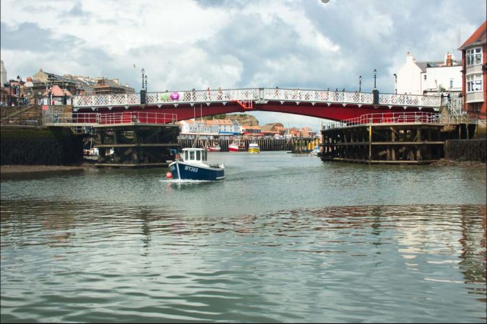
It’s easier to clone in large areas that don’t have a lot of detail or color shifts in them until you become used to using it.
Another way to delete spots from your photo is to use an eraser or healing brush. These are ‘smart tools’ that require no source point – you just click on the object you want to delete and it blends your blemishes with the surrounded area.
Sharpening
Sharpening your images should be the last step in your workflow, once you are satisfied that you have your image looking the best it can be.
It’s easy to overdo sharpening, and you’ve probably seen images that have a hard, almost “crunchy” look around detail edges. When you look close up, you can see the artefacts surrounding the details, and it spoils what could have been a good image.
This close up shows what oversharpening looks like:

The details are harsh and contrasty, and it ruins the image.
Do your sharpening at 100% zoom, so you can see the effects on your image at full size. I would keep the amount to 15% or less. Make the changes gradually, and stop to look at your image after each change.
Sharpening won’t make a blurry image sharp, no matter how much you try, but it will help to give a clean look to your image – the finishing touch. RAW files always need a touch of sharpening, as they come out of the camera a little soft, whereas JPEG’s are sharpened by the camera itself.
Once sharpened, your image is ready to convert into JPEG or TIFF file and show the world.
Final Thoughts
That’s it! You’ve reached the end of the workflow. It doesn’t take very many steps to take your image from straight out of camera RAW file to polished finished image, but it’s worth the time it takes.
As you get used to it, you’ll get quicker and more skillful. There are many tutorials out there which will help take you from beginner to advanced image editor if that is what you want to do.
Cameras We Use and Love
These are the brands of cameras we use and love:
Best Camera Selections
Best Selection of Canon DSLR Cameras
Best Selection of Panasonic Lumix Cameras
You might also like: How to take better holiday videos

Bio: ‘Max Therry is an architecture student who is fond of photography and wants to become a professional photographer. He is also working on his own photography blog about photo editing, modern photo trends, and inspiration. Feel free to reach him by email‘.
This post contains affiliate links from which I stand to earn a small commission but at no expense to you. Lifestyle Fifty Website is a participant in the Amazon Services LLC Associates Program, an affiliate advertising program designed to provide a means for sites to earn advertising fees by advertising and linking to Amazon.com. Thanks to everyone who supports my blog. Please read my full disclosure here.

Thank you am a beginner you have giving me the confidence.
Thanks for this very helpful post. I edit floral images often and enjoyed reading the tips that Max has provided, especially the order in which images should be edited.
Thanks Ludmila. Max was so clear with his instructions wasn’t he 🙂
Hi Donna, I’m so glad you enjoyed these tips. Max laid it out so clearly, didn’t he. I’m already experimenting.
I’m 75 and this article is the best that i’ve ever read. So easy to understand, “Thank you for sharing “.
Glad it helped Theresa 🙂
Hi, Max – These are truly wonderful tips. I look forward to experimenting with a few of them.
Hi, Jo – Thank you for featuring Max today. This is a very helpful post.